50 Approved and Rejected Icons: Clarity for Your Brand
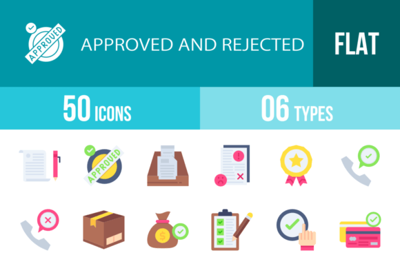
In the fast-paced world of digital interaction, clarity is currency. Whether you are a developer building a mobile app, a marketer designing a landing page, or a small business owner creating instructional print materials, the ability to instantly communicate "yes" or "no" is vital. This is where the 50 Approved and Rejected Icons collection steps in. It is more than just a set of graphics; it is a comprehensive visual language designed to streamline user experiences and reinforce brand professionalism across every platform you can imagine.
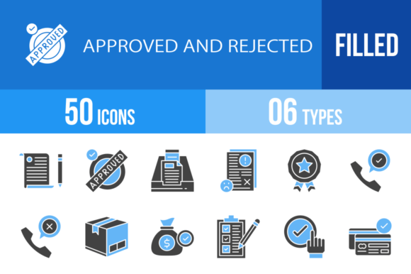
This collection is built on the foundation of the unigrid system, ensuring that every icon maintains perfect geometric consistency. You get a balanced mix of 50 Approved and Rejected Icons, alongside 50 distinct Filled Blue and Black variations. The result is a versatile toolkit that allows you to toggle between a sleek, minimalist aesthetic and a bold, high-contrast look depending on your project's needs. From Face Recognition security protocols to Delivery Box logistics, this set covers the specific nuances of modern digital workflows.
Visual Consistency and the Unigrid System
One of the most challenging aspects of using mixed design assets is achieving visual harmony. When icons have different stroke weights or varying corner radii, the design feels disjointed. The 50 Approved and Rejected Icons solve this through rigorous adherence to the unigrid system. This approach ensures that whether you are using the Thumbs Up icon or the Credit Card Rejected icon, they sit on the canvas with the same optical weight.
The style is distinctly modern, favoring clean lines and negative space that align with contemporary sans serif font trends. This makes them ideal for web design and social media graphics where screen real estate is limited. The personality of the set is authoritative yet approachable. It avoids overly playful cartoonish elements, making it suitable for serious applications like Policy documentation or Face Recognition security interfaces, while remaining friendly enough for e-commerce contexts like Remove From The Cart interactions.
Strategic Applications for Designers and Entrepreneurs
For designers and marketers, these icons serve as critical functional elements that guide user behavior. Consider the impact on visual hierarchy. On a complex pricing page, using the Badge or Stamp Rejected icon can instantly draw the eye to specific plan differences, reducing cognitive load for the visitor.
Here is how different professionals can leverage this collection:
- Mobile App Developers: Use the Mobile Check or Password Approved icons to provide immediate tactile feedback during onboarding flows.
- E-commerce Managers: Implement Delivery Box Rejected or Product Approved icons to clarify order statuses in customer dashboards, reducing support tickets.
- Content Creators and Bloggers: Enhance editorial layouts by using Speech Bubble Approved or Bad Feedback icons to break up text and highlight pros and cons in reviews.
- Corporate Trainers: Use Checklist, Procedure, and Agreement icons in presentation templates to make training materials more digestible.
Because the collection includes 100% vector icons, they are infinitely scalable. You can place the USB icon on a tiny favicon or blow up the Globe icon for a trade show banner without losing a pixel of quality. This scalability is a massive advantage for maintaining brand identity consistency across print and digital mediums.
Technical Flexibility and Format Utility
Real-world design work requires flexibility. You might be working in Adobe Illustrator for a logo design, CorelDRAW for signage, or Canva for quick social posts. This asset pack acknowledges that reality by providing 6 different formats: AI, CDR, EPS, JPG, PNG, and SVG.
The SVG format is particularly crucial for modern web design. It ensures that your Approved and Rejected icons load quickly and look crisp on retina displays. For print design, the vector formats (AI, EPS, CDR) allow you to match the icons precisely to your brand identity color palette. You can easily edit the Blue and Black fills to match specific hex codes, ensuring that the Cash Bag Approved icon feels like a native part of your financial app’s UI.
Furthermore, the inclusion of both outline and filled versions adds depth to your typography and iconography pairing. Use the outline version for inactive states and the filled version for active states in UI design. This creates an intuitive user experience without requiring additional assets.
Enhancing Usability and Brand Perception
Icons are a silent ambassador for your brand. A generic or poorly designed icon can cheapen a premium product, while a thoughtful, well-crafted icon elevates the perceived value. The 50 Approved and Rejected Icons are designed for maximum usability. They avoid overly complex metaphors that might confuse international audiences. Instead, they rely on universal symbols—a Shield for security, a Post Terminal for shipping, and a Laptop for tech.
When you integrate these into your projects, you are doing more than just decorating; you are improving readability and engagement. A well-placed Delete or Remove From The Cart icon reduces friction. A clear Hired or Agreement icon reinforces positive confirmation.
For entrepreneurs and small business owners creating their own templates, this set is a lifesaver. It eliminates the need to hunt for mismatched icons from different sources. You have a complete ecosystem of status indicators ready to go. Whether you are building a dashboard for a Laptop Approved service or a feedback form using Good Feedback and Dislike options, this collection provides the professional polish required to compete in today's market.