50 Approved and Rejected Flat Multicolor: Icons for Clear Communication
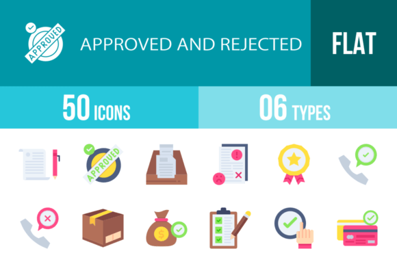
In the world of digital design, clarity is currency. Whether you're building a mobile app, designing a website, or creating a presentation, the icons you choose can make or break user experience. That's where the 50 Approved and Rejected Flat Multicolor icon set comes in—a versatile collection of 100 icons that speak the universal language of status and feedback. These aren't just decorative elements; they're functional design assets built for real-world projects where communication needs to be instant, intuitive, and visually cohesive.
Understanding the Visual Style and Personality
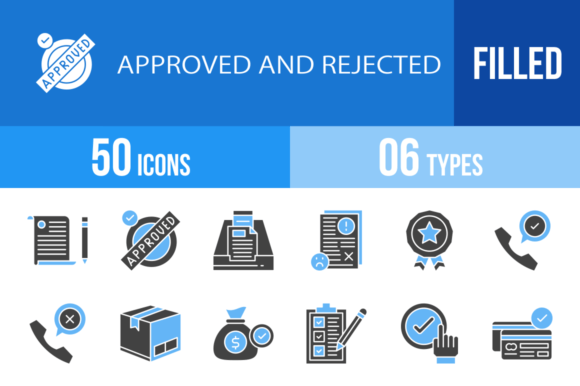
The 50 Approved and Rejected Flat Multicolor icons follow a flat design philosophy with a multicolor palette, meaning they use simple shapes, clean lines, and a limited but effective color scheme to convey meaning. This approach avoids gradients, shadows, and complex textures, focusing instead on immediate recognition. The personality of this set is professional yet approachable—it's modern without being cold, detailed without being cluttered. Each icon is designed within a unigrid system, ensuring consistent proportions and alignment across the entire collection. This systematic approach is what makes them feel unified, even when depicting diverse concepts like Face Recognition Approved, Delivery Box Rejected, or USB Drive Approved.
The multicolor aspect isn't arbitrary. Colors are used strategically to reinforce meaning—greens and blues often signal approval, while reds and oranges denote rejection or caution. This visual coding taps into common user expectations, reducing cognitive load. For a designer, this means you're not just adding pretty graphics; you're embedding a layer of usability into your project. The flat style ensures they scale beautifully from tiny mobile interfaces to large print materials without losing legibility or becoming visually heavy.
Where These Icons Shine: Real-World Applications
Think about the last time you used a banking app, an e-commerce site, or even a simple to-do list. Status indicators—approved, rejected, pending—are everywhere. The 50 Approved and Rejected Flat Multicolor set is tailored for these exact scenarios. Here’s where they fit naturally:
- Mobile Apps and Web Design: Use Mobile Check for transaction confirmations, Password Approved or Password Rejected for security feedback, and Product Approved for shopping cart statuses. Their consistent style helps build a cohesive user interface that feels polished and trustworthy.
- E-commerce and Business Platforms: Icons like Credit Card Approved, Delivery Box Rejected, and Remove From The Cart are essential for guiding users through purchase flows. They reduce support queries by making processes self-explanatory.
- Corporate Presentations and Reports: In a slide deck, using Agreement, Checklist, or Policy icons can visually summarize complex points. They help break up text-heavy slides and improve information retention for your audience.
- Marketing and Social Media Graphics: Create engaging posts with Thumbs Up, Good Feedback, or Speech Bubble Approved. They're perfect for highlighting customer testimonials, survey results, or promotional calls-to-action in a visually dynamic way.
- Print Materials and Packaging: Because they're 100% vector icons, you can scale them for use on brochures, instruction manuals, or even product packaging. The Shield icon, for instance, could denote security features on a physical product box.
For entrepreneurs and small business owners, this set is a practical toolkit. It allows you to maintain a professional visual language across your website, app, and printed materials without needing a dedicated design team for every asset. The consistency in style reinforces your brand identity, making your business look more established and reliable.
Integrating Icons into Your Design Workflow
Choosing the right icons is just the first step. Integrating them effectively requires a bit of strategy. Start by auditing your project's communication needs. Where do users need feedback? Where could visual cues reduce confusion? Map out these touchpoints and assign specific icons from the set. For example, use Document Approved and Document Rejected in a file management system, or Call Approved and Call Rejected in a communication app interface.
One of the key strengths of this collection is its font pairing versatility. While these are icons, not a typeface, their clean, geometric style pairs exceptionally well with modern sans serif fonts like Open Sans, Lato, or Montserrat. If your brand uses a serif font for headings, the icons' simplicity will complement rather than compete. Test your chosen icons alongside your typography to ensure they don't clash in weight or style. The goal is visual harmony, not a battle for attention.
Consider the included formats—AI, CDR, EPS, JPG, PNG, SVG—as your toolkit for different contexts. Use SVGs for web and app development for crisp rendering at any size. PNGs are great for quick implementation in presentations or social media posts. The vector formats (AI, EPS) are essential for print projects or if you need to customize colors to match your brand palette precisely. This flexibility is what makes it a premium font asset—it's ready to adapt to your workflow, not the other way around.
Practical Tips for Maximum Impact
Before you dive in, keep these practical considerations in mind:
- Context is King: An icon like Reject or Delete carries negative connotations. Use it where negative feedback is a natural part of the user journey, not as a decorative element. Misuse can create unintended friction.
- Accessibility Matters: Always pair icons with text labels or ensure they have proper alt text for screen readers. Relying solely on color to convey approval or rejection can exclude color-blind users. The shapes themselves are distinct, which is good, but explicit text is better.
- Customization with Care: The multicolor palette is designed to work as a system. If you change colors, do so intentionally across related icons to maintain the visual logic. Changing Thumbs Up to red and Thumbs Down to green would create confusion.
- Licensing for Commercial Use: Always verify the license for your intended use. This set is suitable for commercial projects, but understanding the terms ensures you're covered for client work, products for sale, or large-scale distribution.
Ultimately, the 50 Approved and Rejected Flat Multicolor set is more than a collection of graphics. It's a communication system. It helps you build interfaces that feel intuitive, presentations that feel clear, and brands that feel consistent. By choosing icons designed for maximum usability within a coherent system, you're investing in design assets that solve real problems—saving you time, reducing user confusion, and elevating the professionalism of everything you create. In a crowded digital landscape, that clarity isn't just nice to have; it's a competitive advantage.