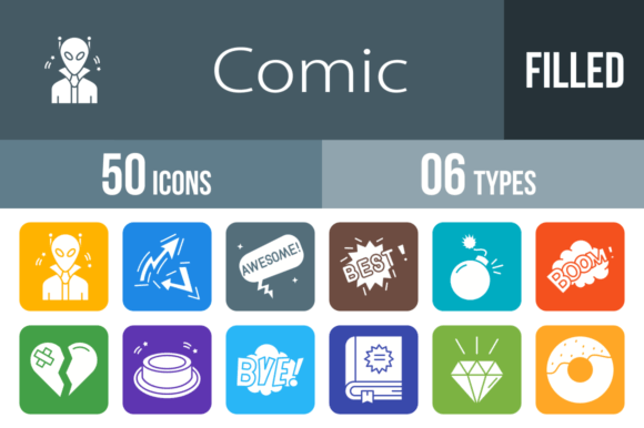
50 Comic Filled Round Corner Icons for Dynamic Visuals
When you need to inject immediate energy and clarity into a project, static text often falls short. This is where visual communication takes center stage. The 50 Comic Filled Round Corner Icons set is a robust design asset tailored for creators who demand versatility without sacrificing personality. Designed using a unigrid system, this collection ensures that every element aligns perfectly, providing a cohesive look whether you are building a mobile interface or designing a physical pamphlet.
Visual Style and Versatility
The defining characteristic of this icon set is its approachability. Unlike sharp, corporate iconography, the Comic Filled Round Corner Icons utilize soft curves and bold fills. This style softens the user experience, making interactions feel friendlier and more intuitive. The personality of these icons is undeniably playful, yet they maintain a level of professionalism that prevents them from looking childish in the wrong context. They strike a balance between the whimsical nature of comic books and the functional requirements of modern web design.
One of the greatest strengths of this collection is the file variety. You receive the icons in AI, CDR, EPS, JPG, PNG, and SVG. This means you are not locked into a single ecosystem. A graphic designer can tweak the vector paths in Illustrator, while a developer can drop the SVGs directly into code for crisp rendering on any screen size. Because they are 100% vector, scaling them up for a presentation slide or down for a mobile app tab results in zero loss of quality. This adaptability makes them a premium resource for any creative toolkit.
Strategic Applications in Branding and Marketing
For small business owners and marketers, consistency is the bedrock of a strong brand identity. Using disparate icons from free sources often leads to a disjointed visual language. By integrating the 50 Comic Filled Round Corner Icons, you establish a unified aesthetic across all touchpoints. Imagine using the "Rocket" icon for your startup's launch email, the "Megaphone" equivalent for social media announcements, and the "Heart" for customer appreciation posts. This visual shorthand accelerates recognition and builds trust with your audience.
These icons shine in packaging design and editorial design as well. If you are publishing a zine or a magazine with a pop-art influence, the "Pow," "Boom," and "Zap" bubbles are essential. They act as display elements that guide the reader's eye and emphasize key points. For social media graphics, where attention spans are fleeting, a bold "Wow" or "OMG" bubble can stop the scroll. They function as visual anchors that communicate emotion faster than text, a crucial factor in effective digital marketing.
Practical Implementation and Usability
Designers will appreciate the practical engineering behind this set. The "unigrid system" mentioned in the features is not just a buzzword; it ensures that the "Alien" icon occupies the same visual weight as the "Envelope." This saves hours of alignment work in UI/UX design. When building a mobile app, you need icons that sit comfortably within a grid without looking cramped or floating aimlessly. These icons are pre-optimized for that reality.
Furthermore, the variety of subjects covers a wide range of scenarios. From emotional indicators like "Broken Heart" and "Awesome" to functional items like "Button" and "Question Mark Bubble," the utility is broad. Here are a few practical ways to deploy them:
- Mobile Apps: Use the "Like," "Star," and "Win" icons for rating systems and achievement badges.
- Presentations: Replace bullet points with "Dots" or "Arrows" to maintain audience engagement.
- Templates: Incorporate "Spaceship" or "Robot" into tech-themed newsletters to reinforce the subject matter.
- Crafting: The "Donut," "Rainbow," and "Party" icons are perfect for stickers, invitations, and scrapbooking.
Enhancing User Engagement
Visual hierarchy is a fundamental concept in design, and icons play a pivotal role in establishing it. By using the 50 Comic Filled Round Corner Icons, you create clear focal points. For instance, placing the "Warning" or "Shh" icon next to a critical piece of information ensures it is not overlooked. In web design, these icons can serve as navigational aids, helping users scan content quickly to find what they need.
The "Bubble" variants—such as "Hi," "Sorry," and "Thankyou"—are particularly useful for communication platforms. They mimic the look of speech, making the interface feel conversational. This is a subtle psychological cue that encourages user interaction. Whether you are designing a chat application or a customer support page, these elements humanize the digital experience.
Choosing the Right Asset for Your Project
When selecting design assets, it is vital to evaluate the fit with your existing aesthetic. If your brand relies on a minimalist, ultra-modern look, these comic-style icons might serve better as accent pieces rather than primary navigation. However, for brands that value friendliness, fun, and high energy, this set is an ideal match.
Consider the color palette as well. While the icons are filled, the vector formats allow for easy color changes to match your specific brand identity. You can change the "Dynamite" from red to blue to fit a cooler color scheme without losing the integrity of the design. Always test how the icons interact with your chosen typography. Pairing these playful icons with a serious serif font can create a delightful contrast, while using them with a rounded sans serif font will amplify the friendly vibe.
Ultimately, the 50 Comic Filled Round Corner Icons offer a blend of style and substance. They are not just decorations; they are functional tools designed to enhance readability, guide user behavior, and inject personality into your work. For content creators, entrepreneurs, and hobbyists alike, this collection provides a reliable foundation for visual storytelling.